Let's delve into UX design with our creative director, Angela Dallin. Today's blog is full of insights into the strategies and thought processes behind creating intuitive and engaging user experiences.
- How RRC approaches UX design?
- Our UX design principles
- Collaboration in UX design projects
- UX design process
- Recent project example
Can you briefly explain UX design and how your team approaches it?
Angela: User Experience, commonly known as UX, refers to a person's overall experience while using a product – such as a website or an application.
UX designers strive to create a positive experience for the users of their website or app. They study user behaviour, preferences, as well as potential pain points to develop a product that is easy and enjoyable to use. Great UX design leads to increased customer satisfaction, loyalty, and profitability. Poor UX causes users to bounce from your website or app and damages their opinion of your brand.
The UX design process we follow at RRC is part of every digital project we create, whether it’s a website, an online portal, a landing page or an application.

What fundamental UX design principles are essential for a modern online experience?
Angela: Here is my ultimate list of the UX design principles:
- Prioritization of the target audience
Designing interfaces that prioritize the needs and goals of users will be crucial for future design processes. As technology continues to advance, it will become even more important to understand the target audience and align the interface with their expectations. - Minimalist design
Striving for minimalism in interface design will be key, as users will expect a clean, organized, and focused experience. - Consistency
Consistency in visual elements, interaction patterns, and terminology will remain a priority. Additionally, providing clear visual cues and feedback to help users navigate complex interfaces. - Accessibility
Accessibility for users with different abilities and needs will be a must-have feature. - Customization
Allowing users to customize their experience and providing shortcuts for experienced users will be important. Designing interfaces with clear visual hierarchies and prioritization helps users get to the information they need. - Usability Testing
Regular usability testing with representative users will remain a valuable tool for refining interfaces based on feedback.
How do you work with clients, developers and other stakeholders to ensure a website or other digital product exceeds expectations?
Angela: Keeping an open line of communication with clients, developers and other stakeholders throughout the entire design and development process is essential. We do this through regular meetings, gathering information from the client and stakeholders, sharing design mockups and prototypes, and providing the opportunity for feedback. We love working together as a team because it makes the final product better!
Can you shed light on your step-by-step UX design process?
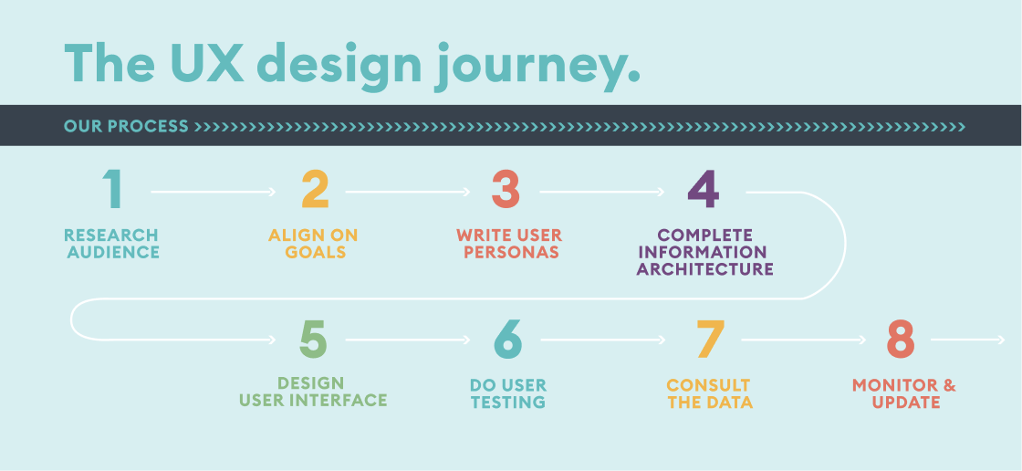
Angela: Yes! Here is the general process we follow:

-
We research our audience.
The first step in creating a digital product is understanding our target audience. We ask ourselves who will be using it, when, why, how and where. We try to figure out what is most important to them and what they want to see.
-
We align on the goals.
This step lays the foundation for the success of your website or app. We have to determine your objectives so we know how your offering should be communicated to your audience. We bring your senior management team together and ask them a lot of questions to ensure we develop a successful strategy.
-
We write user personas.
Based on our target audience research, we create a few fictional characters and write a narrative for each – who they are, where they come from, what is important to them and what they want to get out of the digital product. We use these user personas to see the product through the audience members’ eyes. This helps us to design and develop the product that appeals to them and meets their needs.
-
We complete the Information Architecture.
Information Architecture (IA) involves organizing a website's functionality and content into a structure people can navigate intuitively. This stage takes more effort than you’d think! Especially if you have an existing website that’s been added onto for many years – it tends to turn into quite a mess! The IA process includes site mapping and wireframing. We figure out the purpose of each site page in order to know what content is necessary and what belongs elsewhere.
-
We design the user interface.
We apply the brand identity and use visual design principles to create a beautiful, functional product. We ensure the menu and content look good and are easy and intuitive to navigate on all devices. We also try to add an element of delight – there is always an opportunity to engage them in a way that is unexpected.
-
We do user testing.
Budget permitting, we do a soft launch of the website and test it with a sampling from your target demographic. This can help us gather data and feedback to adjust and create a top-notch user experience before the hard launch.
-
We consult the data.
After the launch, we use Google Analytics or other tools to track data. In the case of a website, we track how visitors arrive on the site and how they use it, in order to ensure they are getting the information they need.
-
We monitor and update.
We use the data we collect to make updates and improvements to the website or application. We want to always be updating the content, keeping it fresh and accurate. We want to make sure the digital product doesn’t get stale or irrelevant.
Can you provide any recent examples of projects where you've effectively applied this UX process?
Angela: We recently worked together with Leaseplan Canada to develop a vehicle management portal for ALL of Amazon’s delivery vehicles in Canada. The portal we created ensures the data that is pushed to and received from is completely accurate and efficiently assembled–while providing a pleasant experience for the operators. Everything from onboarding right through to scheduling routine vehicle maintenance and fuel consumption tracking is integrated into the portal in an appealing and user-friendly manner. On our website, you can learn more about Leaseplan’s vehicle management portal project.


Conclusion
Creating a phenomenal user experience requires a lot of effort and planning, but it’s worth it! Constantly questioning and always adapting means you get the best and most effective product – resulting in a better website that helps propel your brand and improve your business’s bottom line.
Angela Dallin
Creative Director Angela takes every project through a demanding creative process, beginning with research and analysis, continuing to brainstorming and conceptualization, before presenting her design solution. She is a highly creative and pragmatic team player. With a broad range of creative experience, Angela has the ability to see even the most difficult design challenge to completion.
.png?width=2000&name=Wireframes%20(2000%20%C3%97%20874px).png)


.png?width=175&height=227&name=Website%20(Letter).png)


