We interviewed our Designer, Brendan Cave, to gain expert insights on the visual representation and perception of the mining industry. This article is a piece of his expert advice.
Mining has come a long way in recent years. The industry is transforming itself, using new sustainable technologies and more innovation than ever before.
But unfortunately, many people still have negative perceptions about the mining industry.
What they don't know is—mining is essential as we transition to a low-carbon economy. Electric car parts, solar panels, and wind turbines all need metals and minerals—which come from mining. Because of this disconnect between the public’s perception, and what mining actually does for us, the Mining Association of British Columbia (MABC) wanted to set the record straight.
So they hired us to build a new website that would better educate the public about the importance of mining, and the essential role it plays in British Columbia.

Developing An Approachable Visual Language
While designing the new MABC website, Red Rocket set out to accomplish the following objectives through the design we developed:
- Help people rethink how mining impacts their life.
- Communicate that every community in British Columbia is a mining town.
- Provide access to reports about the industry and its impact.
- Assist job seekers in finding a meaningful career in mining through a consolidated job board.
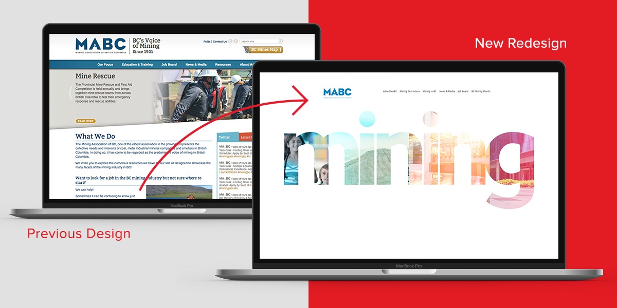
We wanted to represent Mining in BC more accurately as a contemporary, exciting and future-forward industry. Their current website was locked in the past, and reminiscent of historical mining practices. Progressive things are happening in BC’s mining industry, and it was a great opportunity for MABC to convey that message by redeveloping of their website.
Brendan Cave, the lead designer on this project was responsible for creating a visual language for the new MABC website. We sat down to chat about how Brendan was able to accomplish this and get insight into his process.
Why did you choose the design direction you did to solve the client’s issue about making the industry more relevant to regular British Columbians?
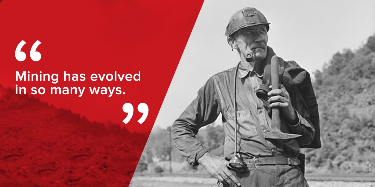
Brendan: Mining has evolved in so many ways.
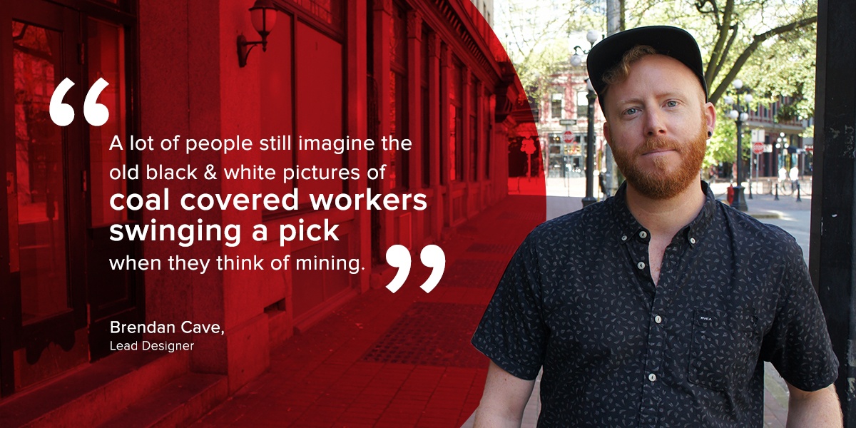
A lot of people still imagine the old black-and-white pictures of coal-covered workers swinging a pick when they think of mining. Today’s BC mining companies are thinking globally and about the future. And the communities that have been built on, and are thriving from mining are an important part of this province.
We wanted to create a design space that was as forward-thinking and approachable as these corporate and community cultures. We chose wide-open white space and a friendly palette to better represent the way things are headed. Metaphorically speaking, the goal was to wipe the coal off those old dark, black-and-white pictures and bring renewal to a traditional industry’s image.
The design solution is a big departure from their legacy image. Tell us about some of the challenges you had in convincing the client it was right for them.
Brendan: No convincing necessary!
The client was immediately receptive to the concepts we put forward because they summed up exactly what needed to be done for the future of mining in this province.
Because we received such a thorough brief and clear direction, everyone was on the same page from the project start. During the design process, we created a few solutions. But the clean, horizontal scrolling layout that had clusters of imagery and text to convey each idea was the clear winner for us. This was the case internally, and also for the client.
(Click below for a look at the new layout.)
The design has a lighter touch. Why did you think it would work for the mining industry?
Brendan: The lighter design is a reaction to the designs of yesterday. Heavy machinery in a pit mine represents only a fraction of what the mining industry means. The new outlook is a bright future of scientific advancement, reduced environmental impact and strong communities. So the design had to convey that.
Were there any challenges finding appealing and appropriate imagery for the site?
Brendan: Yes, we struggled quite a bit to find imagery.
The client was scouring to find imagery from the communities, and we wanted to use imagery that was BC mining-centric and native to our province. Obviously, that’s a little tricky to come by when you’re dealing with a very specific subject area.
A photoshoot is often the way to go, but sometimes in a project where you have limited time and budget, you just gotta go with the best of what you can get. We ended up executing this quite well because of the BC-specific image banks that were available to us.
Do you have any comments about the colours you chose to go with for the site?
Brendan: We wanted to keep it friendly and approachable. The trick was having the imagery and the colours work together. Because we were going with the lighter pastels, which was a clear departure from the usual heavy, dark mining colours and imagery, we had to make sure it all worked. We found a nice colour palette and integrated it on a clean white background, which worked out well and conveyed the sentiment we were aiming for.

Were there any challenges that you encountered along the way?
Brendan: Yes. My pencil kept breaking while working on the initial sketches. No, but seriously, on a personal level, I always want to be honest with a design. And at first, I had some concerns that what I knew at the time about mining wouldn’t translate in an honest way to a fresh, clean feel. Fortunately, the more I learned about how BC mines contribute to tech research, clean energy and the future of BC, everything came together nicely.
Any final thoughts?
Brendan: The initial brief and meetings with our liaison and the client were very insightful and thorough. Even though we had a tight timeline, things came together very well. I believe we were successful in creating a forward-thinking and approachable website while changing the conversation around mining in BC.
Sangeet Anand
Director of Digital Marketing Sangeet draws on her business background, creativity and technical know-how to deliver innovative marketing solutions for a variety of our clients.


