These days, it's easier than ever to build successful digital ad campaigns. Thanks to available data, we know which design decisions work, why they work, and how to leverage design to boost results.
In this post, I'll share 5 key takeaways for ad design, based on data compiled by Rocket Fuel, (now Sizmek.) They looked at 38,151 distinct banner ads, from 1076 advertisers, across 2184 marketing initiatives for a period of over six months.
Here's what they found.
1: Logo Placement is HUGE
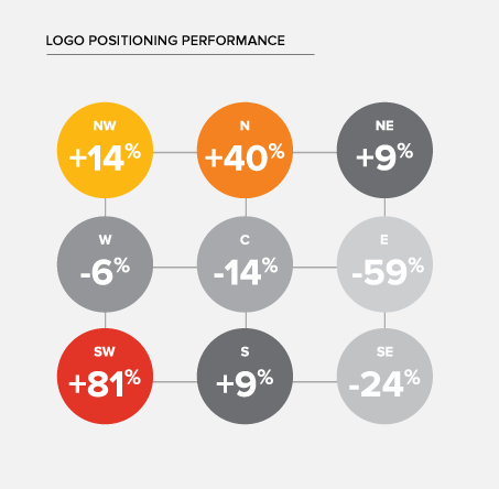
Where you place your company logo has a big influence on conversion rate (CR). So where's the best area to place it?
The bottom left corner. This is the location that generated the best click through results. The worst was on the right in the centre.
2: Animated Ads Work Better
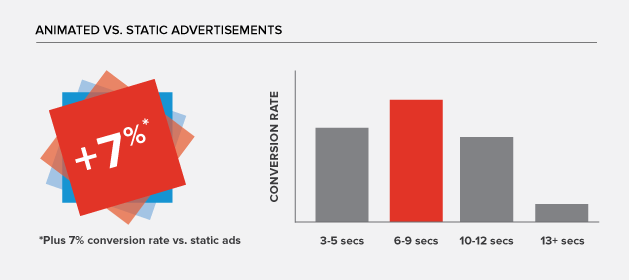
Animated ads had a 7% higher conversation rate (on average) when compared to static ads. 40% of animated ads were between 10 and 12 seconds in length, while ads that were six to nine seconds long had a conversion rate lift of 38% against the category average.
3: Remember Product Placement
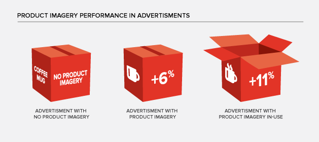
Ads that displayed a product image seemed to have an edge when compared to ads that didn’t. Product image ads averaged 6% higher conversion rates than those that did not show the product. This was further compounded when ads showed products “in use”. These performed 5% better than those that merely showed the product.
4: Red Sizzles
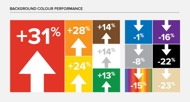
The background colour of the ad had a major influence on its effectiveness. Is it a surprise that RED outperformed all others? Orange came in at a respectable second place.
What's interesting to note is that same ads were placed, but only the background colour was changed. This colour adjustment had a significant impact on the click through rate. Other colours and combinations of colours were also tested. Here are the results:
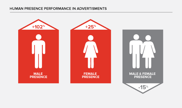
 5: Don't Forget the Human Touch
Ads that featured a person also experienced a lift in their performance when measured against those that did not. It was a revelation to discover that ads featuring men averaged higher CR’s than ads that featured women. That being said, not all the details are evident in this discovery. There are vertical markets where preference remains aligned to gender.
These are just a few tips to consider when creating a digital ad campaign. We hope these findings can help make your programs perform better. Remember, if you're not getting the website traffic you want, it's time to re-think your strategy.
Need help getting your brand to stand out online and offline? Start with our free guide: A Calculated Approach to B2B Brand Strategy, below.
Perry Boeker
Principal & Marketing Strategist A results-driven creative thinker, Perry is a marketing management professional with a proven record of achievement in Strategic Planning, Team Leadership, and New Concepts Development.


