With the prevalence of digital media, it is necessary for modern brands to be more responsive, more interactive, and more social. Today the consumer has the power, as never before, to shape public brands through the multitude of media and applications available.
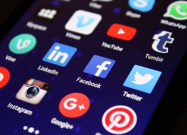
Facebook, Twitter, YouTube, Instagram and TikTok are just a few ways the public has direct access to communicate with a brand and shape the public’s perception of that brand. The consumer expects the brand to be as responsive as any medium through which it is accessed while maintaining consistency in how it appears.
Creating a Flexible Brand Identity System
Traditionally, there were fewer channels to convey a brand’s identity and therefore fewer opportunities for the public to experience your brand. Consistency was achieved through repetition of the same elements – organized in the same way – over and over and over again. Today, a consumer is likely to encounter your brand several times a day and too much repetition tends to make brands become stale and ineffective.
With a modern brand identity system, consistency should not only be created through repetition but also through recognition of pattern. Creating a cohesive and flexible brand identity requires the creation of a logical pattern. Instead of having a brand identity focused around one big central idea, have multiple smaller ideas. This aids in brand recognition and keeps the brand nimble enough to evolve rapidly and organically in a fast-paced, digital world. Repetition aids recognition, but variation in patterns creates relevance that sustains long-term interest.
Patterns, by definition, are a configuration of smaller elements. These smaller elements are recognizable but can still be rearranged to form a new meaning: a collective pattern of personal expression. In this way, brands can build local expressions separate from their global ideas.

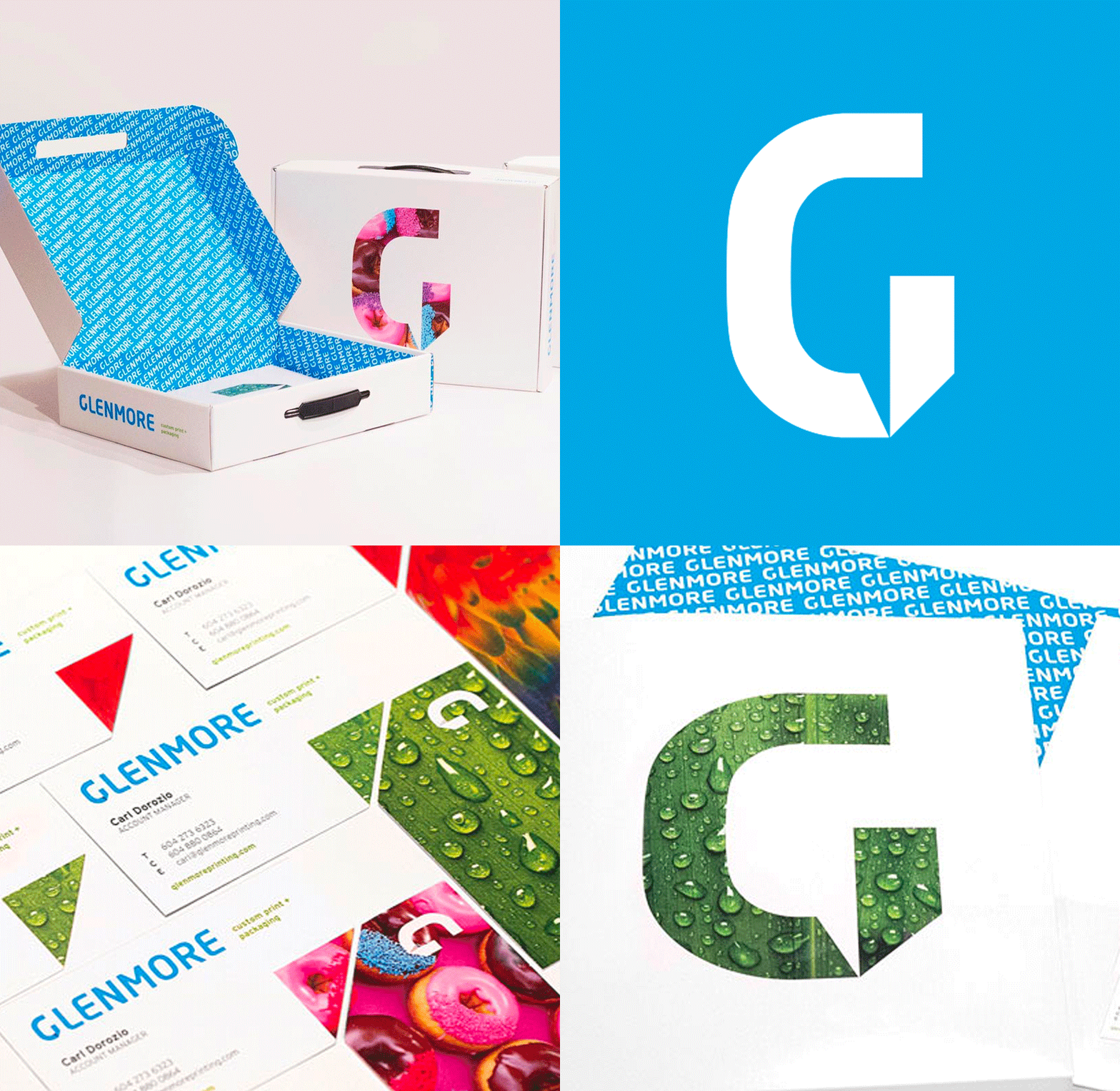
When Red Rocket Creative rebranded Glenmore Custom Print and Packaging, we conceived a brand platform that was flexible and customizable – to showcase all of the new and exciting print methods that are continuously being invented. The bold logo icon was used like a window to feature brightly saturated images and a multitude of printing techniques. There were water droplets in ultra UV gloss, parrot feathers with a silky textured varnish and even doughnuts with scratch and sniff ink. This creative platform allows for the client’s marketing materials to always be fresh and enticing.

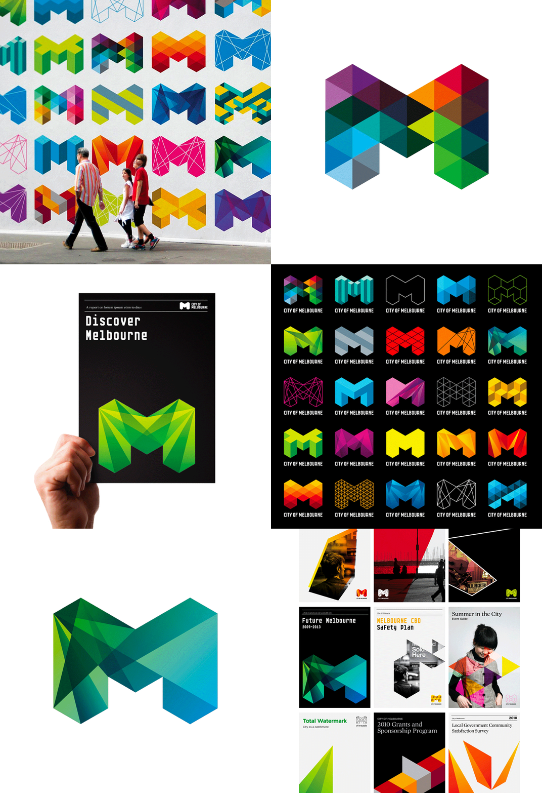
The City of Melbourne logo, created by Landor and Associates, is another great example of a flexible brand identity system. The repetition is created through the shape of the “M” and the use of geometric shapes. The flexibility is provided by the variety of shapes and colours used to create the “M” shape.
Brand guidelines or graphic standards manuals are still very important, but these documents should be brief and inspirational. They should provide the parameters to ensure an appropriate level of consistency while also allowing the brand to continue to grow in richness and depth with each experience. This way a brand never gets old; it always stays relevant and appealing.
The best marketers understand that their brand is one of their most valuable assets. Discover laws to branding and what it means to your company.
Angela Dallin
Creative Director Angela takes every project through a demanding creative process, beginning with research and analysis, continuing to brainstorming and conceptualization, before presenting her design solution. She is a highly creative and pragmatic team player. With a broad range of creative experience, Angela has the ability to see even the most difficult design challenge to completion.


