Thinking of your next corporate report redesign? Want to captivate your readers and present complex information in an engaging manner? Whether it's a corporate presentation, ESG report or annual report - learn how to build in your brand story and make a visually appeal and informative asset that communicates value.
Visuals are essential in communicating ideas effectively. In this article, we will share some of our favourite examples of visual communication tools we use in annual reports and discuss what makes them so effective.
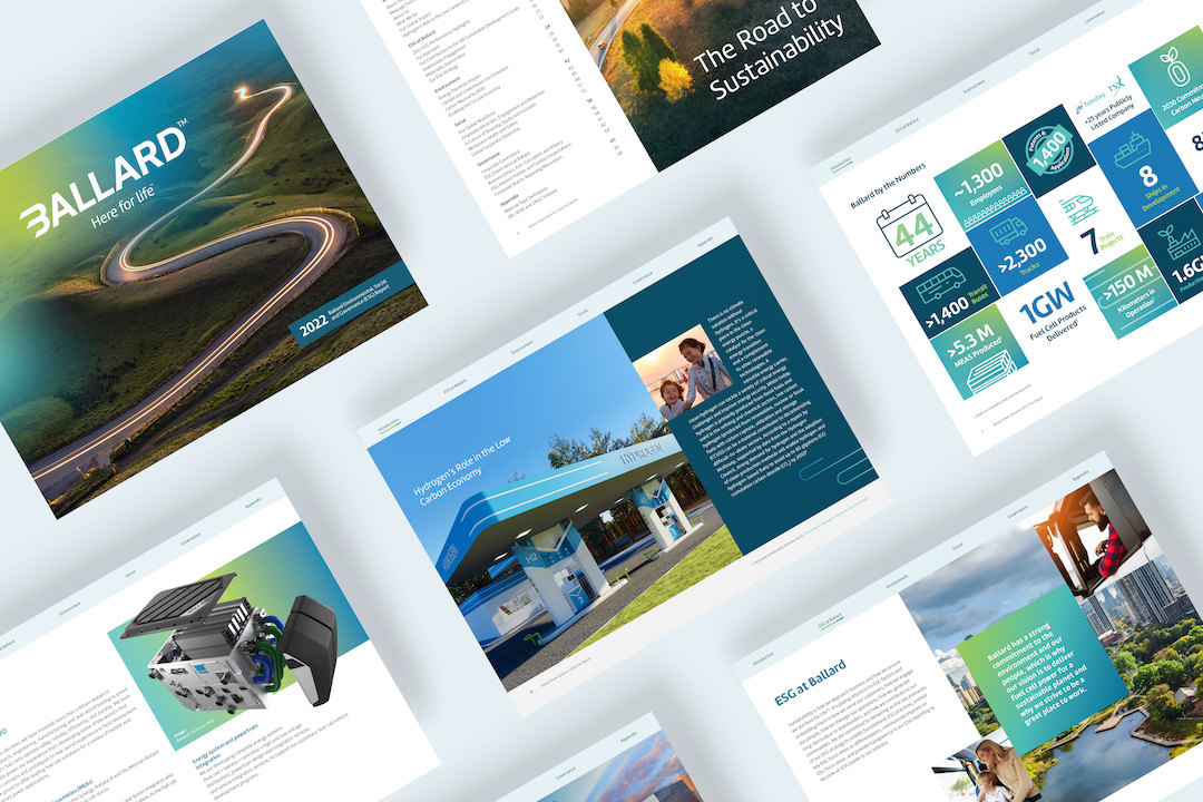
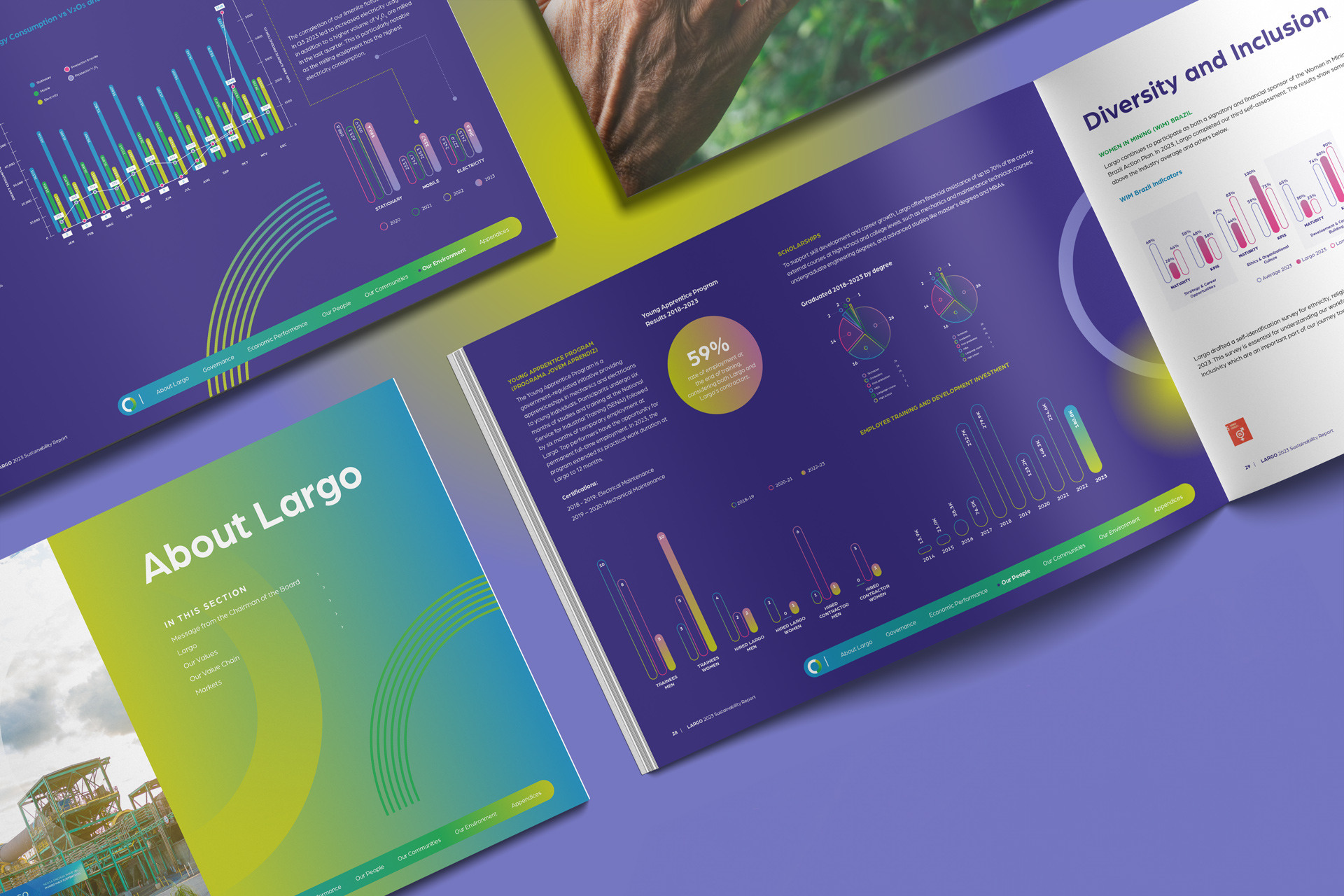
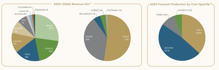
Let's start by sharing some of our favourite visual tools for simplifying data:
All of these examples use colour, scale and design to simplify data and display it in a visually pleasing manner so it can be easily consumed. Now, let's take a closer look at how you can use these visual tools in your annual or ESG reports.
Simplify Complexity
When presenting financial or sustainability data, it can be challenging to make it engaging. However, you can leverage data visualization techniques such as graphs, charts, and tables to simplify complex financial information. Highlight trends, comparisons, and key figures, ensuring that they are easily understood at a glance.
Infographics can be particularly effective in presenting data-driven insights. It's important to ensure that your data is simplified while maintaining accuracy and ethical representation to preserve your credibility with your audience.

Corporate reports should balance comprehensive information with conciseness. Humans are wired to process visuals more quickly than text, so it's essential to present key findings and milestones using clear and straightforward language.
Avoid excessive jargon and technical terms, making the report accessible to a broader audience. Break down complex concepts into digestible sections, employing headings, subheadings, and bullet points to enhance readability.
Tell an Engaging Story

Consider telling a compelling story in your annual report besides the financial aspects. Reflect on your progress in the past year and share it with your shareholders and employees. An engaging report tells a story.
Start by mapping out the key points in your annual or ESG report narrative. Your infographics should have an arc, a climax, and a conclusion. When you find a great data set, mock up your visualization first and figure out what you want to say, before starting the design layout.
Infographics in annual reports
Infographics are an excellent tool for weaving a narrative through visuals, creating a compelling and memorable experience for your readers. Whether you're illustrating your organization's journey, showcasing the impact of your initiatives, or highlighting your company's growth and success, infographics offer a dynamic storytelling tool that captivates your audience. Link the information in a way that makes it easy to understand, and consider segmenting the report into chapters or categories of information for a natural flow.

Consider incorporating interactive elements into your annual or ESG report design, with most reports being viewed online. This could involve clickable sections, animated infographics, or embedded videos. Interactive elements add an extra layer of engagement.
Branding and Consistency

Your corporate report is also an opportunity to showcase your brand identity and establish consistency across your communication materials. Use your brand's color palette, typography, and visual elements to create a cohesive and recognizable design. Ensure that the report remains easy to navigate, with clear section headings, a well-organized table of contents, and a logical flow of information.
Consider the language and style that best aligns with your brand identity. Whether it's a formal and professional tone or a friendly and conversational one, maintain consistency in your writing throughout the report. A consistent brand voice helps build recognition and reinforces your organization's identity.
Strive for a balance between creativity and functionality, creating a visually stunning report that is also user-friendly. Consistency in design establishes trust and familiarity, reinforcing your organization's identity and reinforcing the report's credibility.
Conclusion
Designing engaging annual reports requires a thoughtful blend of visual storytelling, data visualization, concise content, and interactive elements. By employing these strategies, you can transform your corporate report from a mundane document into a captivating narrative that effectively communicates your organization's achievements and goals. Remember, the ultimate goal is to engage your readers, leaving a lasting impression and strengthening the connection between your organization and its stakeholders.

Related posts